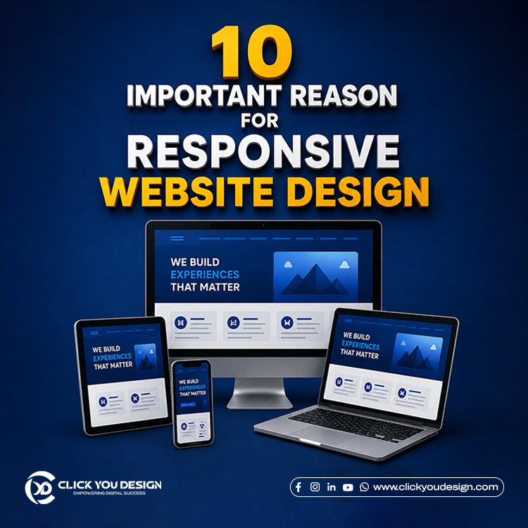
In this blog, we explore the topic “10 Important Reasons for Responsive Website Design.” Responsive design is a crucial part of website designing. Nowadays, people are heavily dependent on mobile phones for quick searches and enquiries. If the responsiveness of your website is not functioning properly, users will leave the page. As a result, it increases the bounce rate and affects SEO performance, leading to a negative impact on visibility. Therefore, choosing a website design with the best responsive web design service is essential.
At Click You Design, we are your reliable web designers, providing clear, neat, and professional website designs for your business needs. So, let’s visit our portfolio and read the blog now.
What is mobile-friendly design?
Responsive design is a modern approach to website development that highlights user experience across different devices. It focuses on enhancing usability by adapting layouts smoothly to various screen sizes. In addition, it considers important factors such as orientation, screen size, and the platform a user selects. As a result, websites become more flexible, user-friendly, and accessible across all devices.
Benefit of user-friendly design
1. Enhance user experience
Responsive design helps enhance user experience by ensuring websites are visually appealing and easy to use. When a website is properly designed to be responsive, it actively engages users and provides an optimal viewing experience. In addition, it allows users to access the website on any device with proper fitting, alignment, and smooth navigation.
2. Boost your SEO Ranking
One significant benefit of responsive design is that it helps boost SEO rankings. Search engines recommend websites that perform properly across all devices. Furthermore, a responsive design increases visibility, reduces bounce rates, and engages users through easy access and seamless navigation. As a result, your website can achieve better search engine performance and reach a wider audience.
3. Increase your audience reach
A responsive website design can increase your audience reach across all devices. Moreover, users expect a visually appealing website that fits perfectly on their screens. As a result, they can navigate the site easily and enjoy a seamless browsing experience
4. Effortless Website Maintenance
Website maintenance becomes hassle-free with a responsive design. Moreover, you only need to manage a single website that works seamlessly across different devices. Instead of creating and maintaining separate websites for desktops, tablets, and smartphones, you can update the same content and layout for all screen sizes. As a result, responsive design saves both time and money while ensuring a consistent user experience across every device.
5. Fast Loading Speed
Fast loading speed is one of the major benefits of implementing responsive design principles on your website. Moreover, responsive design uses a single URL and a unified code structure, allowing pages to load efficiently across all devices. As a result, users can access content quickly and enjoy a smoother browsing experience.
6. Build a Competitive Edge
A well-designed responsive website performs better in today’s competitive market. Moreover, an e-commerce website cannot attract and retain customers if it functions properly only on desktop devices. Therefore, businesses should implement responsive design to ensure a seamless experience across all screen sizes. As a result, they can reach more customers, improve user engagement, and gain a competitive advantage.
7. Budget-friendly choice
A single website that works seamlessly across every device is more budget-friendly. Moreover, creating different websites for the same business just to support different devices is not a practical idea. Instead, businesses can use responsive design to provide a consistent experience across desktops, tablets, and smartphones. As a result, they save both time and money while maintaining a unified brand presence.
8. Increase conversion rate
Businesses need an optimized website to increase conversion rates through faster loading speeds and a visually appealing design that fits every screen. As a result, visitors can browse the website more easily and enjoy a better user experience.
9. Adapt to Changing Technologies
Responsive website design is a future-ready solution that supports long-term business growth. Moreover, it automatically adapts to different screen sizes, ensuring a seamless experience across desktops, tablets, and smartphones.
10. Better analytics
Responsive design helps you monitor and analyze website performance across different devices. Moreover, it provides detailed insights into how your website functions on various screen sizes, orientations, and platforms. As a result, businesses can identify issues, improve user experience, and ensure consistent performance for all users.
Conclusion
In this blog, we discussed 10 important reasons for responsive web design. Responsive web design services play an important role in business websites. If your website is responsive across all devices, you can increase visibility, improve user engagement, and generate more leads. Moreover, faster loading speeds and easy navigation help create a better user experience and encourage visitors to stay longer on your website.
Furthermore, responsive design supports SEO performance and helps your business reach a wider audience. Click You Design offers the best web design services in Trivandrum. From concept to completion, we create websites with proper responsive design and SEO optimization to help your business grow online. Contact us today to build a professional and future-ready website.